Apartment List, Linkedin Banners
ABOUT
Apartment List is a prominent online platform dedicated to simplifying the process of finding a new home. The company offers a user-friendly interface that connects renters with a vast database of available apartments, houses, and condos across the United States. Apartment List stands out for its innovative approach, utilizing advanced technology and data-driven insights to match individuals with properties that align with their preferences and needs. Apartment List has become a trusted resource for those navigating the competitive and dynamic housing market.
PROJECT: Design 2-3 Apartment List branded Linkedin Banners for the Sales team highlight themselves on Linkedin.
ROLE: Marketing Design Intern
COLLABORATED WITH: Sara King, Marketing Designer; Farha Kraish, Director of Marketing; Taemi Lim, Marketing Design Manager; Debbie Sorkin, VP of Design & User Research
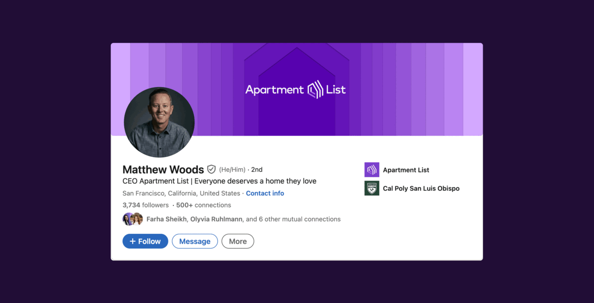
Apartment List's Existing Brand Linkedin Banner
Visual Research, Asking Questions & R1 of Iterations
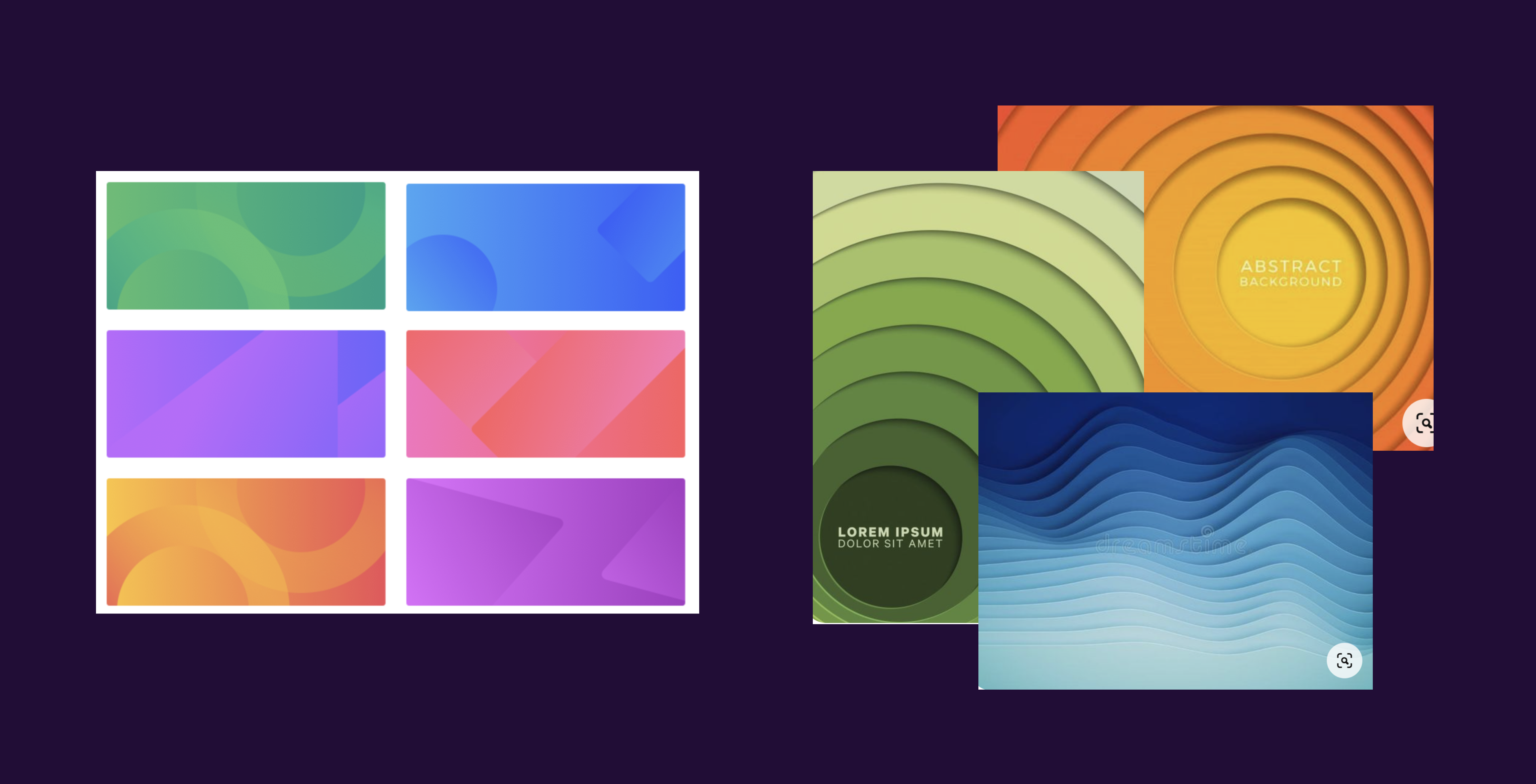
I started my design process by collecting visual research on the landscape of linkedin banners from other rental companies and companies in general. Asking questions like "How do companies treat linkedin banner for their brand?", "What are they doing well at?" and "What should I avoid/ What are they not doing so well in?". Asking these questions help me figure out which direction I want my designs to go for the project.
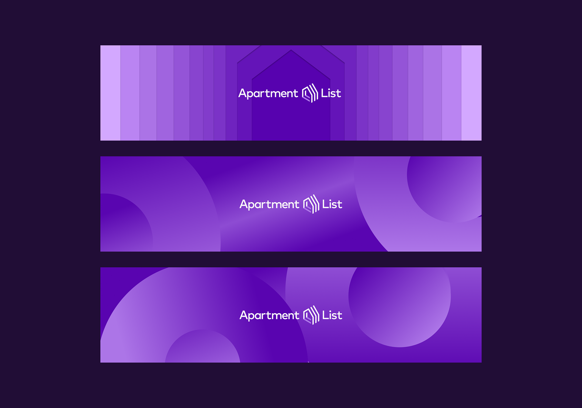
Moving on to the "sketching" portion of my process, I collected existing Apartment List branded assets including backgrounds, patterns, colors, logos, and photography to start putting together designs that I think would fit the Apartment Listing branding the best. For R1 of this project, I wanted to stay close to the Apartment List branding to get a feel for what the stakeholders were looking for.
R1 Feedback & More Visual Research
The feedback for the R1 iterations were meh, the team seemed supportive in some of the designs, but wanted the design to be more fun and exciting than only Apartment List branding. Figma's linkedin banners were mentioned in conversation as well as Redfin's linkedin banners. Overall something more visually interesting that showed more of Apartment List's story instead of logos and colors.
The Marketing Design Manager set up a call to show me a potential direction she sees the project going in with visual inspiration she had. She mentioned possibly using the house shape (in the logo) as a pattern and creating depth through layering. From there, I did some more of my own visual research for R2 of iterations.
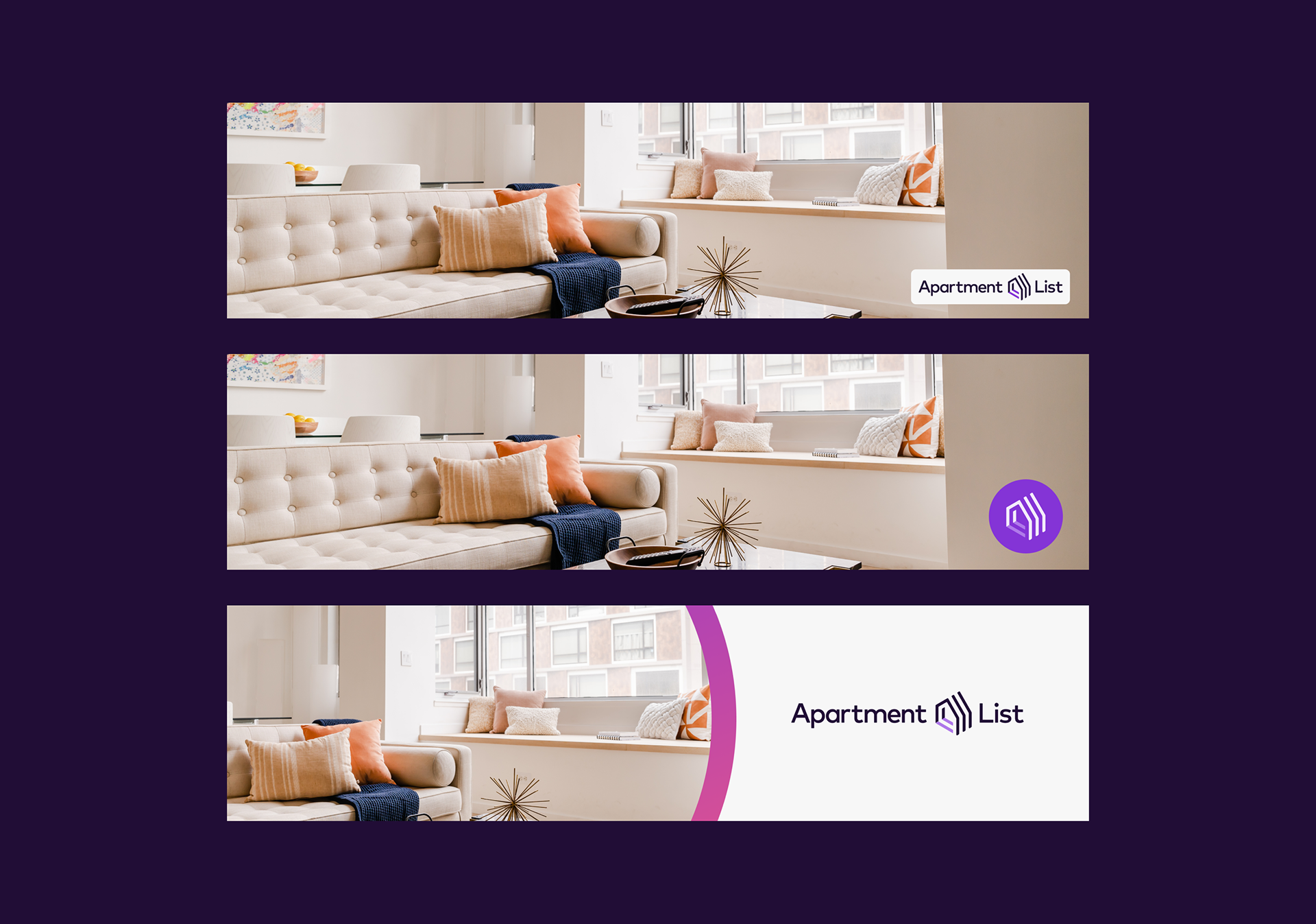
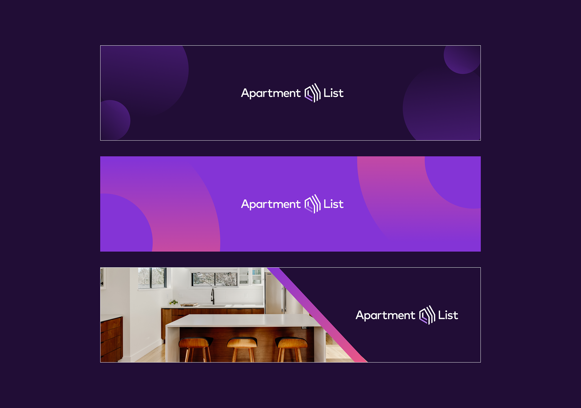
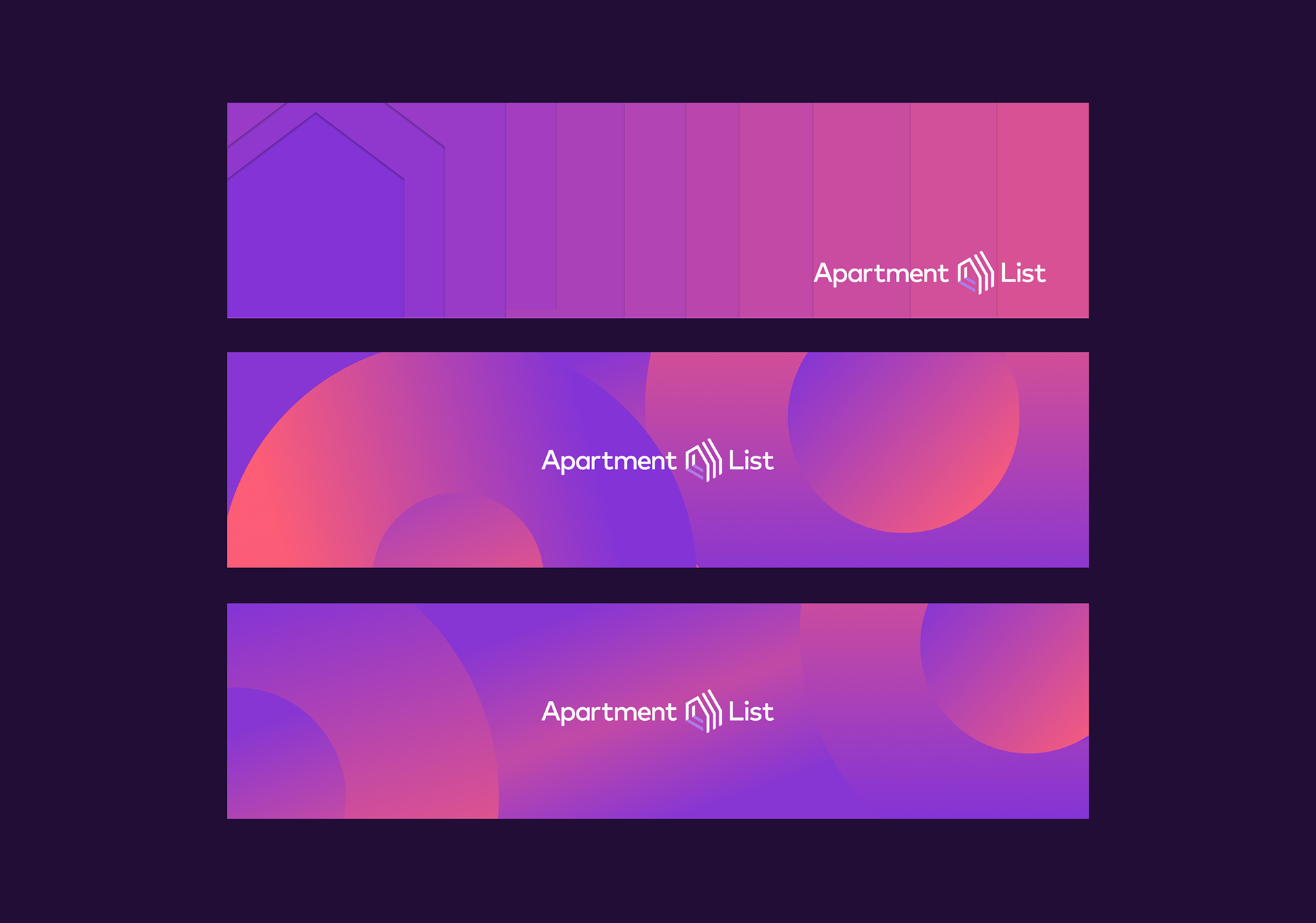
R2 Iterations & R2 Feedback
For the R2 iterations, I allowed myself to be a bit more experimental with the shapes and colors of the brand.
Direction 1: Following up on the Marketing Design Manager's idea, I really worked on creating layered designs using the house shape as the basis.
Direction 2: I played around with gradients, layering and shapes to collage designs that I saw to be a simpler way to use Apartment List colors, while appearing more visually interesting than previous designs.
*All credits to Apartment List*